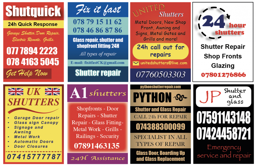
In the third week of the project, I set out by doing some online research about the stickers, trying to see if anyone else had noticed them or if I could find out any information about the businesses advertised. All I could find were two reddit posts where other people had also noticed the stickers and were theorising about their purpose. Some people thought they were intended to clog up and break the shutters they were stuck to, leading to the owner having to call them and have them fixed. Some people had noticed them in South London too, and they were the same businesses. Some people had removed them from their shop fronts only to have them reappear the next day. I couldn’t find anything from the businesses themselves, which is unusual.
I decided to analyse the stickers further, taking note of the fonts and colours used, and making tallies of each. Red and yellow were the most prevalent colours. The fonts were often those accessible via Microsoft Word. I did some further online research about font that were used in the stickers which exist on Microsoft. This led me to think further about the idea of amateur design and accessible design tools, which led me to discover the website https://www.makewordart.com/ which is a recreation of early Microsoft word art.
After playing with this for some time, I made some stickers of my own, which was an exercise in not following any conventional ideas of “good graphic design”, trying to replicate the different styles, using fonts such as Impact, Brush Script and Comic Sans.
At this point in the project, I am feeling that this was an exploration of public space on the high street and the visual language of public graphic design. I am interested in the idea of outsider graphic design (?) as a style. I don’t feel like I’ve come to the conclusion of a final piece. I think this is something I would like to complete and potentially return to at some point to conclude with a whole visual outcome.
Leave a Reply