Here is a selection of behind the scenes bits from unit two, covering experiments/accidents, workshops, observations and inspirations
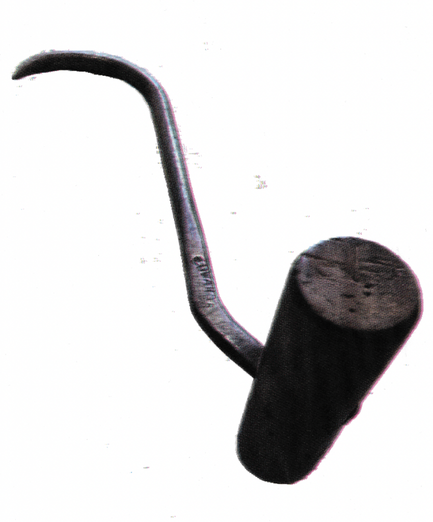
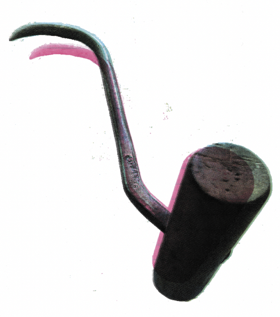
Four colour CMYK print experiments. I was trying out ways to use this image of a dockers hook within my project, using methods I had in my 100 iterations. I scaled the right image incorrectly which I think looks quite fun.
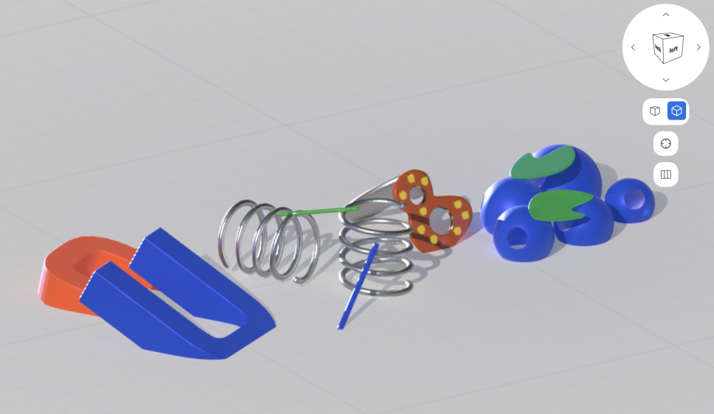
3D scan as part of my 100 iterations – I 3D scanned the image i used throughout my iterations. I had enjoyed this step as I hadn’t tried 3D scanning before.
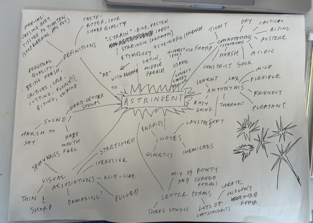
I signed up for Jose Garcia Oliva’s workshop this term, which was “Words as spaces we live in”. We had to bring a word we love and a word we dislike. I chose “astringent” which is a word I don’t like. The above is my research page 🙂
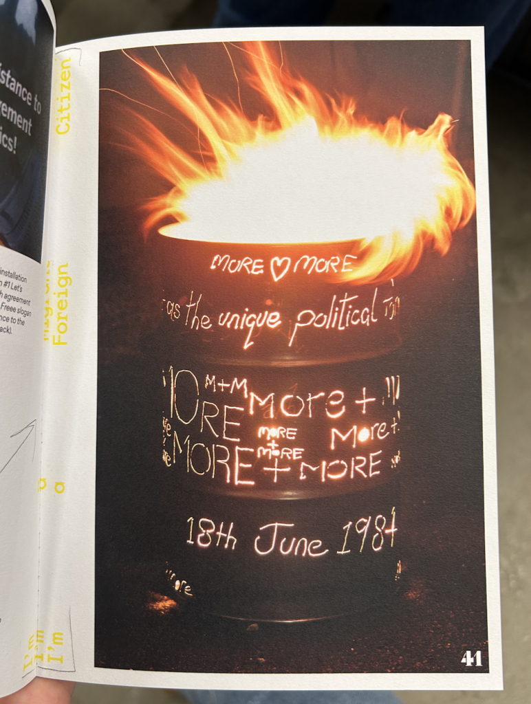
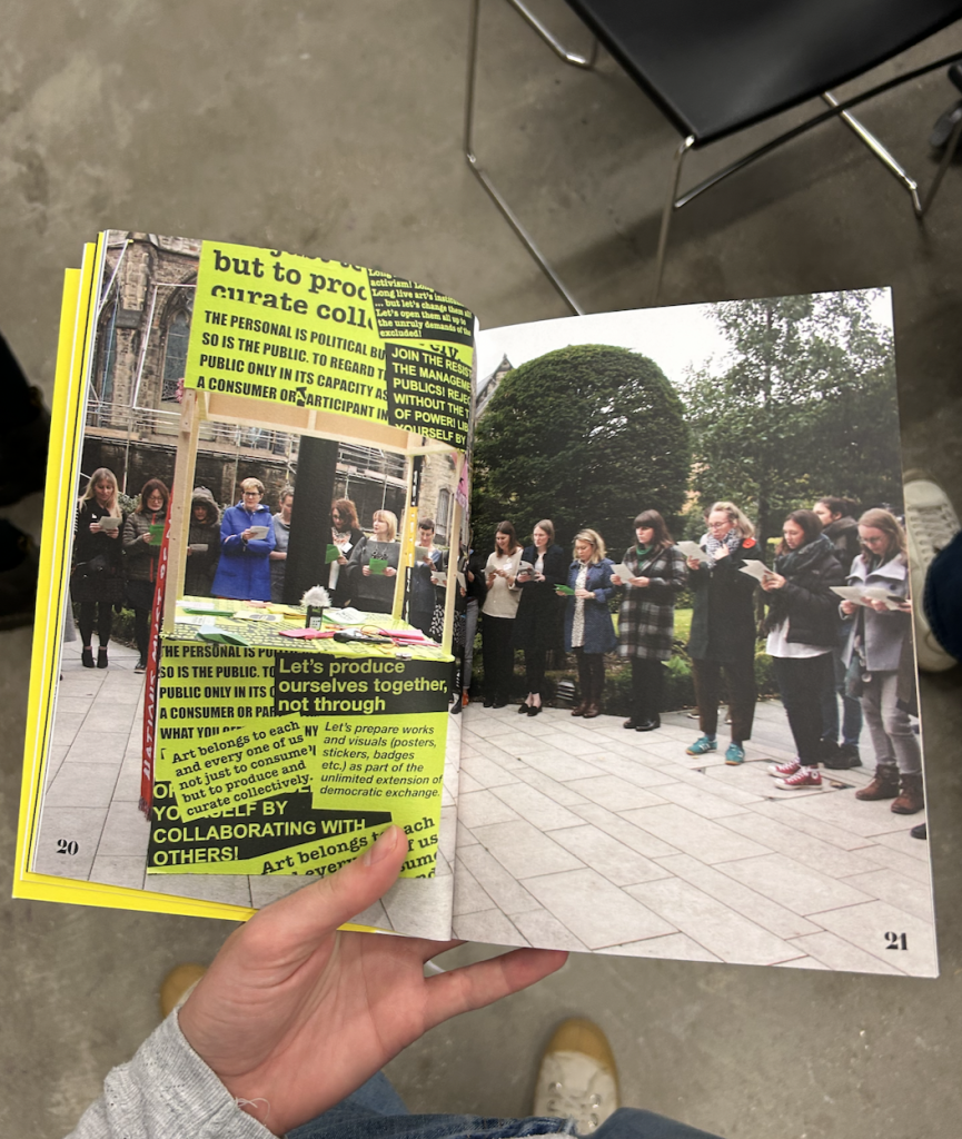
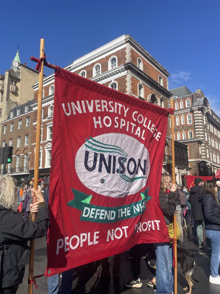
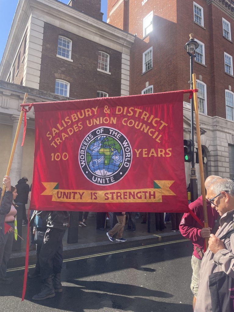
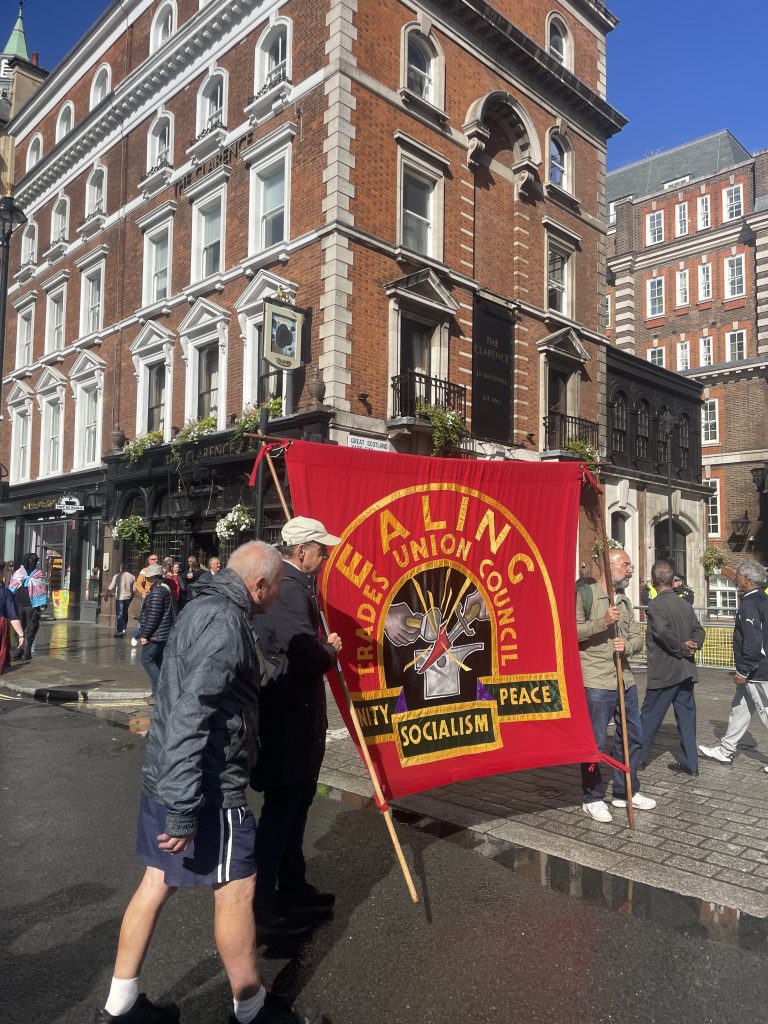
I discovered Freee Collective’s work from Jose’s workshop. They are a participatory art collective that work on socially engaged and protest related projects with different communities. I think their work is visually striking as well as having an ethos I am interested in.
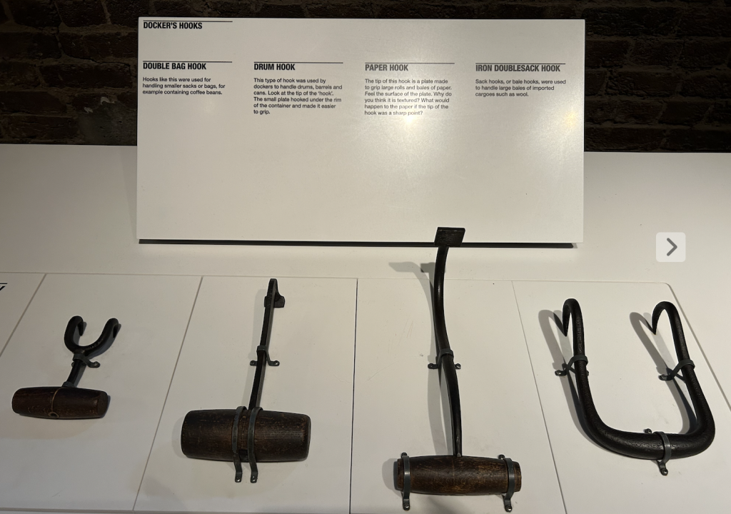
London Docklands Museum dock workers video
I went to the London Docklands Museum to do more research for my project about dockers. I really liked seeing the hooks up close and this video montage of dockers working
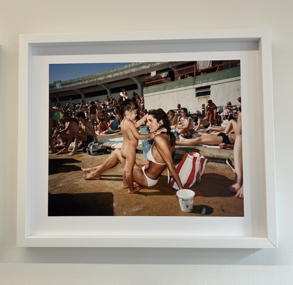
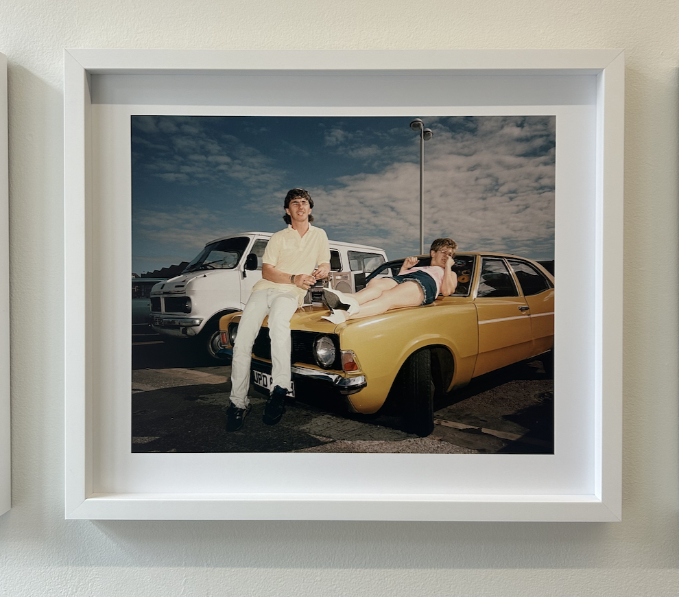
I went to Bristol recently and visited the Martin Parr Foundation. I saw photos from his most famous body of work, The Last Resort. The photos were taken in New Brighton, not far from Liverpool where I am from. I wrote my dissertation about these photos during my undergraduate degree, so it was great to see them in person.
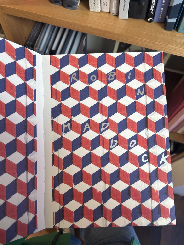
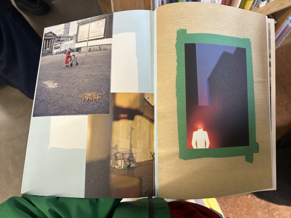
I discovered this book, ‘England or…’ by Robin Maddock, about England after the Brexit vote. It’s mixed media – mainly photography with writing and collage. The experimental style has a real energy and feeling to it, which I find very inspiring.
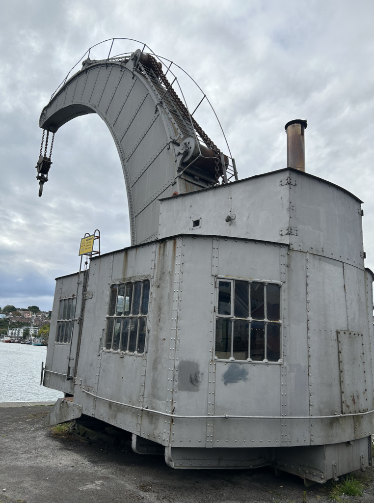
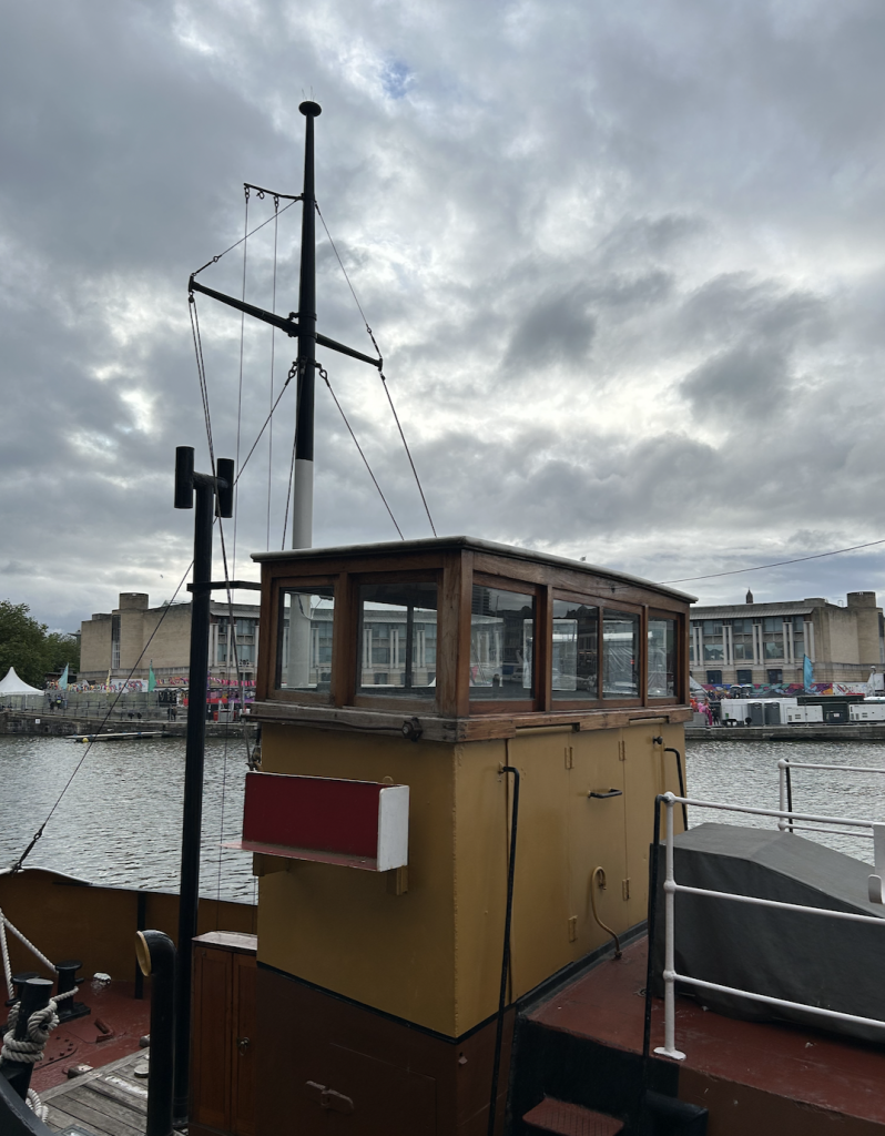
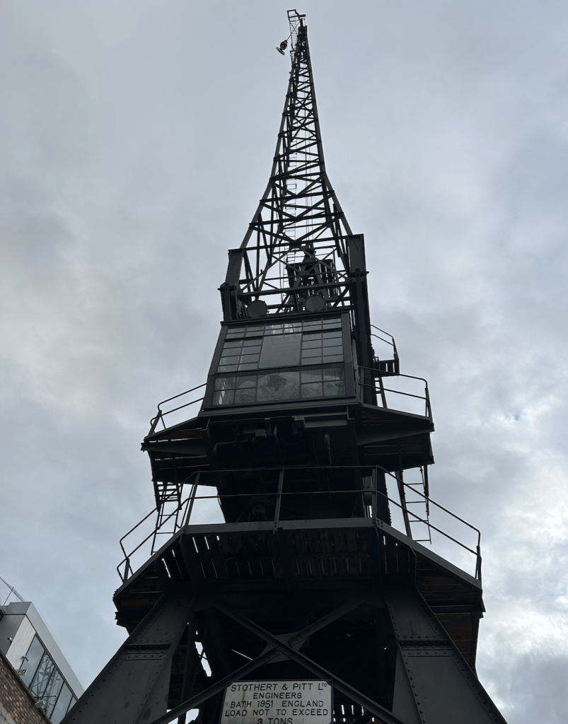
I also explored the docks around Bristol and enjoyed these old structures and that were used to move boats and goods in and out of the water.
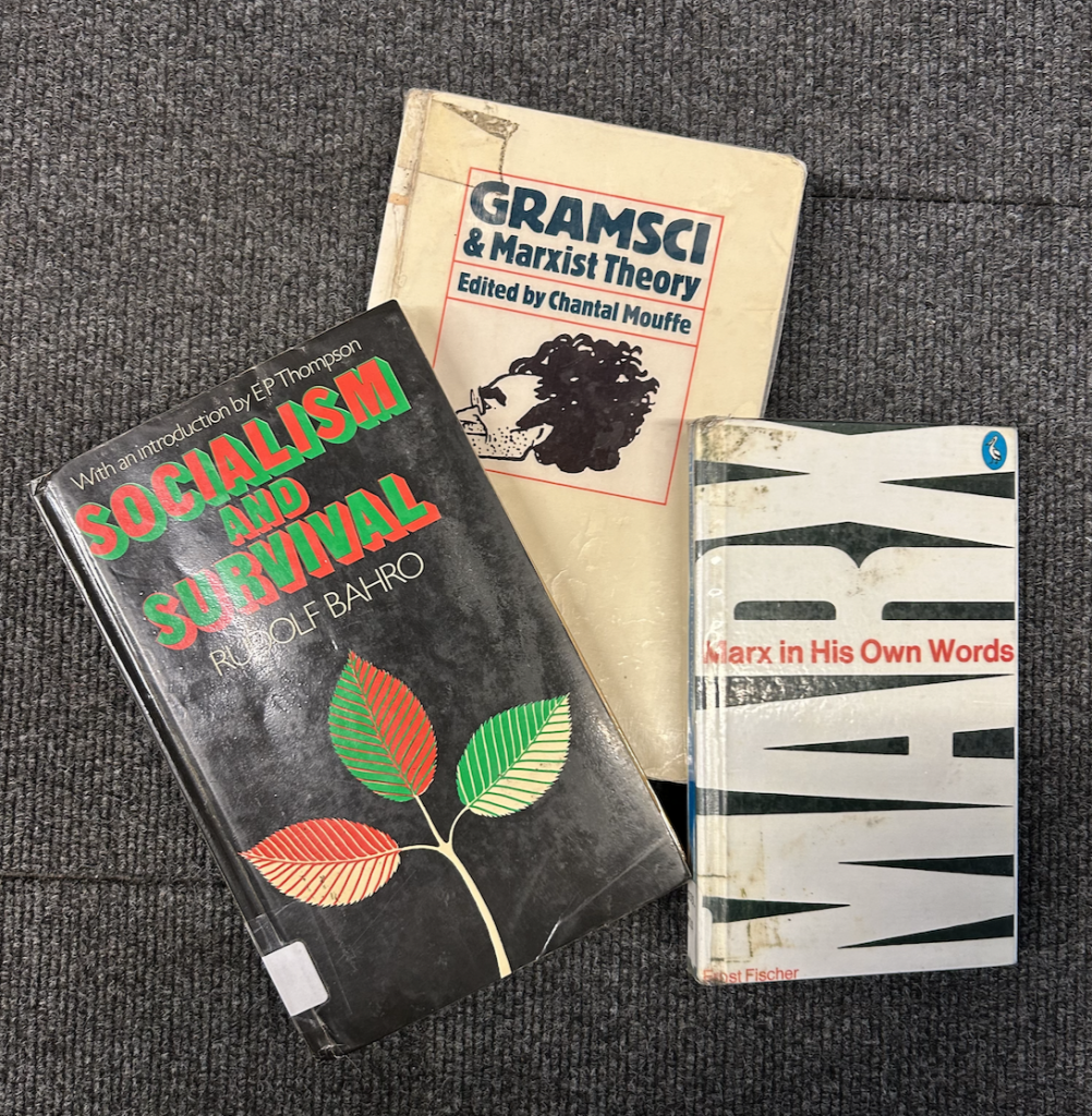
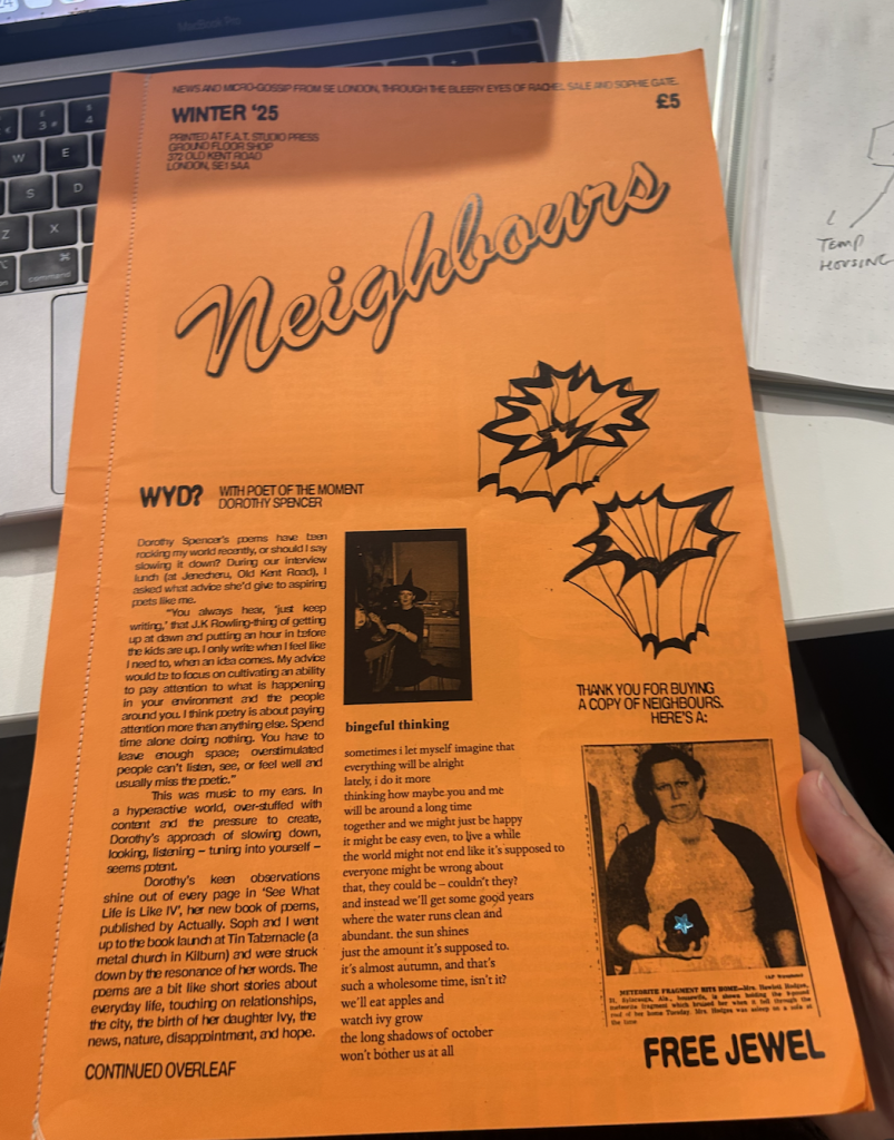
Additional reading – I have been reading some Marxist literature and enjoying Neighbours by F.A.T Studio!