• Methods of investigating week three

    Stickers I made inspired by the stickers I saw on the street

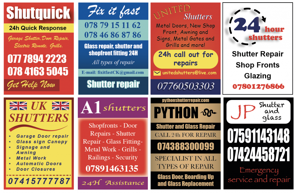
    In the third week of the project, I set out by doing some online research about the stickers, trying to see if anyone else had noticed them or if I could find out any information about the businesses advertised. All I could find were two reddit posts where other people had also noticed the stickers and were theorising about their purpose. Some people thought they were intended to clog up and break the shutters they were stuck to, leading to the owner having to call them and have them fixed. Some people had noticed them in South London too, and they were the same businesses. Some people had removed them from their shop fronts only to have them reappear the next day. I couldn’t find anything from the businesses themselves, which is unusual.

    I decided to analyse the stickers further, taking note of the fonts and colours used, and making tallies of each. Red and yellow were the most prevalent colours. The fonts were often those accessible via Microsoft Word. I did some further online research about font that were used in the stickers which exist on Microsoft. This led me to think further about the idea of amateur design and accessible design tools, which led me to discover the website https://www.makewordart.com/ which is a recreation of early Microsoft word art.

    After playing with this for some time, I made some stickers of my own, which was an exercise in not following any conventional ideas of “good graphic design”, trying to replicate the different styles, using fonts such as Impact, Brush Script and Comic Sans.

    At this point in the project, I am feeling that this was an exploration of public space on the high street and the visual language of public graphic design. I am interested in the idea of outsider graphic design (?) as a style. I don’t feel like I’ve come to the conclusion of a final piece. I think this is something I would like to complete and potentially return to at some point to conclude with a whole visual outcome.

  • Methods of investigating written response

    In Georges Perec’s chapter, “The Street” from his book, “Species of spaces and other pieces” (1974), the writer demonstrates a new way of seeing the street to demonstrate how we become desensitised to the structures and spaces around us. Perec encourages the reader to focus on the mundane and minor details of the environment we see every day. In the chapter, “A Significance for A&P Parking Lots or Learning from Las Vegas” from the book, “Learning from Las Vegas”, by Robert Venturi and Denise Scott Brown (1972), the writers discuss the architecture of the Las Vegas strip, analysing the prevalence of bold signage and large parking lots, discussing its importance as a representation of true American culture. In this written response, I will discuss how both texts explore the street as place of visual communication and the importance of the “ordinary” or “low brow”.

    The focus on observation of the environment on the street is present in both texts to illustrate different points. For example, in “Species of spaces”, Perec outlines a method for true observation, encouraging the viewer to “set about it more slowly, almost stupidly. Force yourself to write down what is of no interest” (1974, pp. 50) Perec is urging the reader to observe as if the reader hasn’t truly seen before, taking in all minor details. Similarly, Venturi and Brown begin their text, stating “Learning from the existing landscape is a way of being revolutionary for an architect…that is to question how we look at things.” (1972, pp. 3). Both share a method of looking, setting an intention to see without judgement. For Perec, this is to immerse himself into the outside world to a point of unfamiliarity; “Carry on Until the scene becomes improbable… until you can no longer understand what is happening” (1974, pp. 53), disconnecting from preconceived ideas of his own environment. Alternatively, Venturi and Brown use this method to argue for their appreciation of the Strip, describing Vegas’ landscape as “an architecture of bold communication rather than one of subtle expression” (1972, pp. 9), something they feel the preceding Modernist architecture movement does not tolerate, describing it as “anything but permissive” (1972, pp.3).

    Perec’s meditation and attempt to be present in his daily environment on the street supports the methods and themes explored in Learning from Las Vegas. The “practical exercises” (1974, pp. 50) he outlines lend themselves to highlighting the everyday aspects of the street. He begins, “Observe the street, from time to time, with some concern for system perhaps.” (1974, pp. 50). Similarly, Venturi and Brown emphasise the importance of observation “We look backward at history and tradition to go forward… with-holding judgment may be used as a tool to make later judgment more sensitive. This is a way of learning from everything.” (1972, pp.3). Perec is describing visually observing, while Venturi and Brown are also looking figuratively to understand better their reality in present day and as a critical tool.

    In conclusion, I believe Perec and Venturi and Brown use observation as a tool to critically examine their reality. For Perec, this is to situate better understand his position in his environment. For Venturi and Brown, this functions to illustrate their argument for Vegas as a representation of American culture.

    Perec, G. (1974) Species of spaces and other pieces. 1997. Penguin Books Ltd.

    Venturi R. and Brown, D. (1972) Learning from Las Vegas. Routledge.

  • Methods of investigating

    Week one 

    After reading the brief, I immediately had the idea to use Wood Green High Road (high street) as my location to investigate. In the two weeks since I moved to London, I had walked down the high street nearly every day and it had made a big impression on me, so it seemed like an interesting place to focus on.

    After the initial briefing, every time I walked down the high street, I tried to tune in to my surroundings and take photos of anything that seemed important. After reading the Georges Perec text, “Species of Spaces”, I felt I had a method to approach my investigation with. I set out to imagine I hadn’t seen a street before, and to examine every aspect, taking note of everything around me.

    I focused on the stretch of road from Turnpike Lane to Wood Green station and walked up and down each day, using note taking, photographing and drawing as my methods of investigation. One afternoon, I spent an hour in the local Wetherspoons, “Spouters Corner”, which I discovered was an important location historically for the area, where different political groups had organised over the years. One evening, I spent some time in a local Greek bakery, people watching and examining the structure of the street. I had also noticed that along the street, every shop front had a collection of shutter repair stickers in different arrangements. I found these interesting graphically and as a visual image, the walls and windows they were arranged around were different at each shopfront, varying in colour and placement. I also liked the idea of them as a representation of DIY advertising and amateur graphic design, using the street as a sort of large-scale noticeboard.

    After my first tutorial, I received feedback from my tutor and the group that suggested I focus on the local Wetherspoons or the sticker collections I’d noticed in between each shop front. Previously my work has often centred around people, communities and locations so I thought it might be more interesting to go down a more graphic route to push myself and explore something different.

    Week two

    In week two, I set out to analyse the stickers further. I continued with walking the same route up and down Wood Green high street, now capturing all the stickers along the whole stretch. It was interesting to notice the areas where they’d been ripped down, usually more upmarket large franchise shops, whereas independent businesses seemed more covered.

    Looking at the list of images in my camera roll, I was really stimulated by seeing all of them small in one place. I think there was something about the sheer number of all the stickers shown small as one large image that I felt struck by. Then, being able to zoom in and examine them and see all the small graphic detail. I then cropped all of the stickers individually, examining what kind of fonts and colours were frequently or rarely used.

    I also experimented with overlaying the images of the stickers, grouping by colour and background so they were layered, blending into one another. I think this represented the experience of being on the high street and feeling overwhelmed by the constant visual stimuli of the signage and shop fronts. In addition, I was printing out grids of the sticker images, scanning, cropping and reprocessing them to explore and manipulate how they looked. I like the low-res quality this produces, and I think it echoes the DIY amateur look of the stickers themselves.

    During my tutorial at the end of this week, it was discussed that amateur graphic design, as well as the idea of looking at the micro and the macro of all the imagery were some of the themes in this project and that I should try to continue making in a way to investigate this.